Design Intense Lighting Fonts in Photoshop
In this lesson, we will learn how to design intense light lines around an object or person so that you can use this wonderful technique in your future designs.

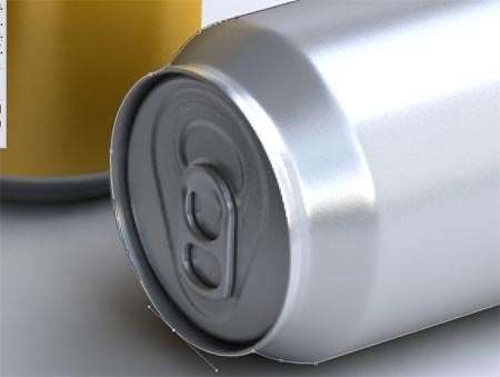
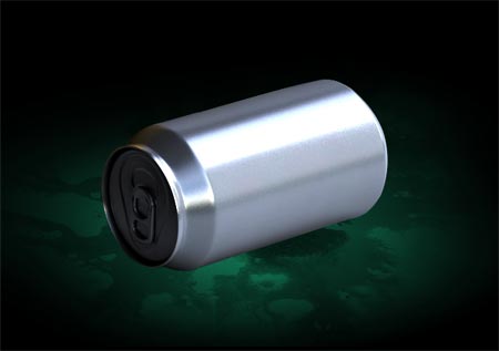
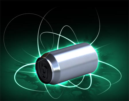
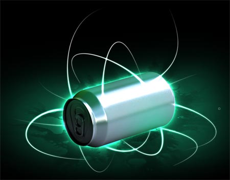
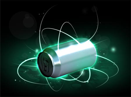
First you have to find the subject that you want to draw the lines of light around. I chose a free photo of a soda can .
Using the Pen Tool draw a path around the box, make a selection and paste it into a new document with a black background.
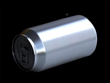
Reselect the element by clicking on the layer of that element and pressing a key, Ctrlthen go to the menu
Select > Feather
And enter the value 1px. Invert the selection then click Delete.
Duplicate the layer, set its blending mode to Multiply, and reduce its opacity appropriately.
This process helps blend the element into the background and give it more realism by erasing the harsh edges and exchanging highlights and shadows.
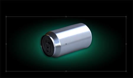
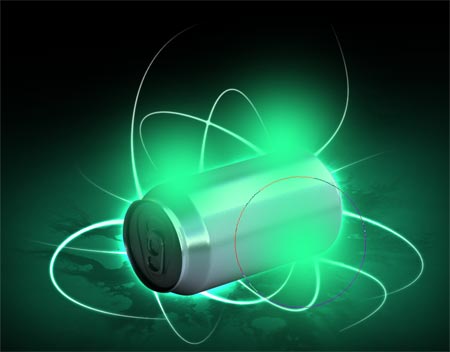
On the new layer, draw a circular selection and fill it with a gradient from black to a color of your choice, I chose green.
Convert the gradient and click vertical.
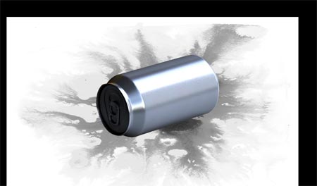
Open up some nice textures and paste them into your document. I chose the watercolor image from within the free GoMedia collection . De-color the image with the Desaturate command.
Change the blending mode to Multiply to convert the white areas of the image to transparent.
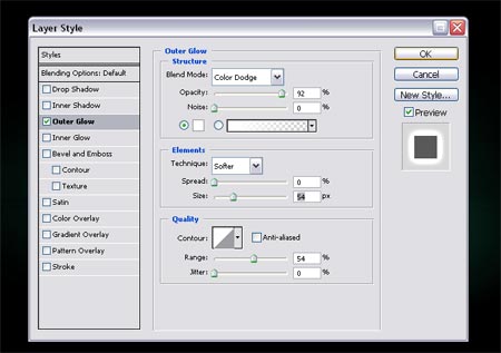
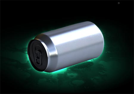
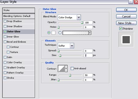
Go to Box Layer Styles, add an Outer Glow, and under the Glow settings change the Blending Properties to Color Dodge to get a really intense glow.
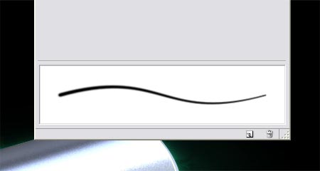
Prepare the brush to draw the lines that we will make glow later, experiment with the brush settings to get thin pointed strokes. The main option for adjusting Control and Minimum Diameter settings in the Shape Dynamics section.
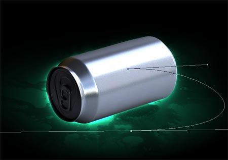
Use the Pen Tool to draw a smooth, curved path, and with the same tool right-click and choose Stroke Path and make sure that Brush is enabled next to Simulate Pressure.
Add another extra Glow to the Brush Stroke layer, using the Color Dodge settings similar to the previous process.
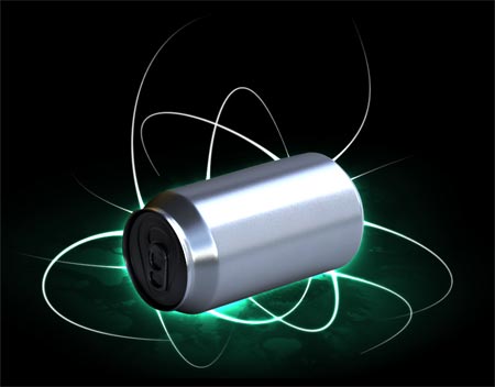
Draw as many lines as you want around the box keeping the lines flowing as smoothly as possible in a variety of directions.
Color Dodge effects work best when overlapping objects are colored in gradients, here I've enlarged the gradient size to allow the lighting effects to appear better around the object.
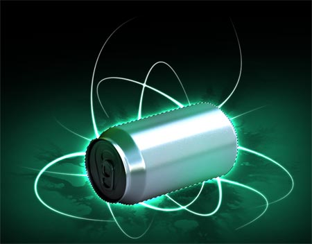
Unfortunately, the hard edges of the bottom material are clearly visible, which distorts the design, so use a large, soft eraser to wipe these edges in a way that blends them with the rest of the design.
We'll add more atmosphere to the element by putting a few more colors on a new layer.
Changing the layer blending properties of these colors to Soft Light will make these colors appear as gentle glows over the element, as if they reflect the lighting of the lines that wrap around the element, adding more realism to the design.
Make a selection from the tray layer then invert the selection and delete unwanted areas.
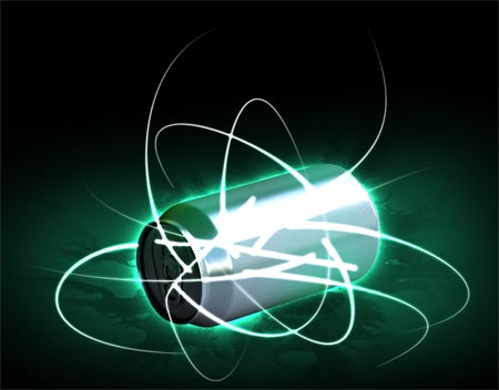
The streaks look amazing flowing from the bottom of the box, but they'll look better if they interact in some way. Move the highlight stripes layer over to the box layer.
Erase most lines, leaving areas where the lines blend with the element.
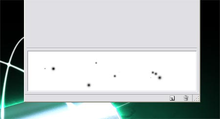
We will add some points of light rays to this design in the form of a group of glowing light spots. Start by setting up a new brush, this time playing around with the values of Scatter, Spacing, and Jitter Size.
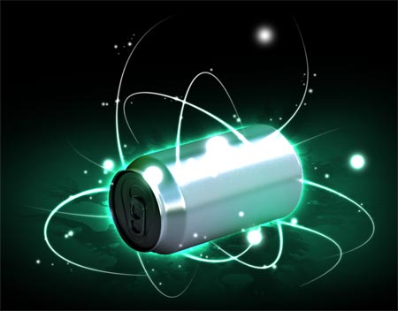
With the Brush Tool, draw a group of these dots of different sizes so that they cover the entire design area around the element and the light lines. Add some outer glow to it like we did for the light strips.
Blot out most of the particles to leave a decent light effect with slight differences in opacity.
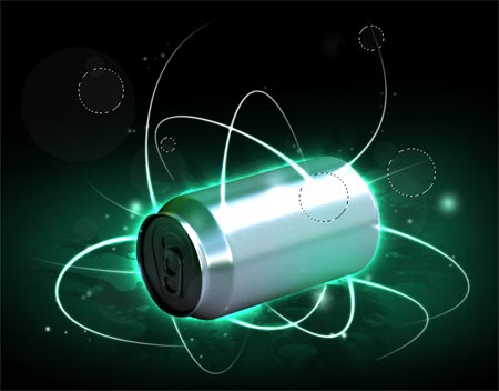
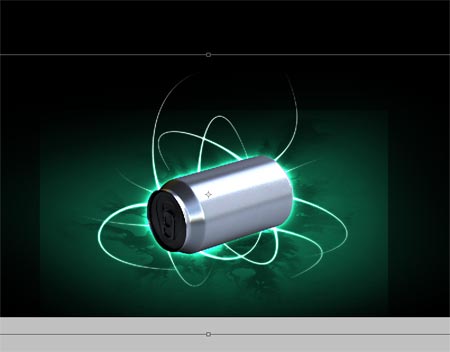
Finish off the image with some looped link loops on multiple layers with very slight opacity. These circles will help give more realism to the design as they appear in the case of camera shooting of illuminated scenes.
تعليقات
إرسال تعليق